
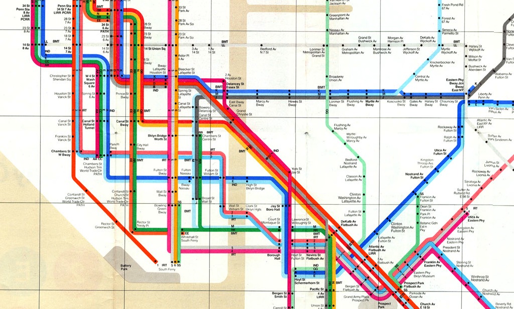
where does the turquoise line go?
I’ve never been a collector, but I have a small—call it “well-edited”—and much-loved collection of maps.
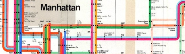
One highlight is my 1972 NYC subway map by Massimo Vignelli. It came to me folded up, like the regular map it is. I bought it off of Ebay from a vendor who called himself something like “MTAGuy.” I pictured MTAGuy as having boxes of these maps in his garage, which he’d found abandoned in some windowless MTA storeroom on Long Island thirty years ago. With incredible foresight, MTAGuy had realized he could make a small fortune one day by selling the maps on a world-wide marketplace made of ether, pixels, and credit card numbers.
The map is framed—creases very much and purposefully intact—and in my living room, over what we call the “reading corner.” It is usually filled with a cat.
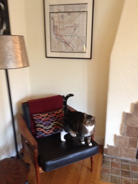
Rosie.
Since I have more enthusiasm than subtlety when it comes to interior decor, I bought the little pillow on the chair because it reminded me of the entwining, exuberantly colored New York City subway lines depicted in the map by its genius designer, who died earlier this week.
Massimo Vignelli called himself an “information architect,” a term that has come to mean something almost wholly data-driven in these tech-obsessed times. By contrast, Vignelli’s subway design is clean and beautiful, but not literal. It is usable, deeply imagined, and wildly interpretive. It is a piece of art that transforms a time and a place—New York, in the 1970s—into icon.
My relationship with this map has taken on a life of its own. I see it new almost every time I’m in my living room—all the flagrant, intersecting colors of New York, a visual distillation of the city’s ingenuity, at once workaday and sublime. And if I wanted to, I could pull the map out of its frame, fold it up, and take it with me.
Grazie mille, Massimo Vignelli.

(Source: Asheind at Italian Wikipedia)


